Polling trends are bad crystal balls
When a pundit says "if this trend continues to the election," stop listening
At the start of an election year, many folk like to try and project the future. Some do it with gut instinct like “Key has the nation’s trust”, others by simple historical precedent like “New Zealanders favour multi-term governments.” These are good fun to read but aren’t usually very rigorous. Others use well-regarded bases in science, like “National is miles ahead in the polls, therefore they’re likely to win,” or “the economy is in the crapper, so the incumbents will lose seats”. These are an improvement, but sometimes get you woolly, ambiguous predictions.
A third group in New Zealand has started using polling trends, as opposed to polling levels, to project an election result.
“The gap is closing, gradually but surely. And it could be very close indeed by late 2011…” said Marty G at The Standard in December, an argument he has continued to make since. I think this style of psephology is seductively sciency but sadly shallow, and should be resisted rather robustly. Here’s why:
1. You can get almost any result you want.
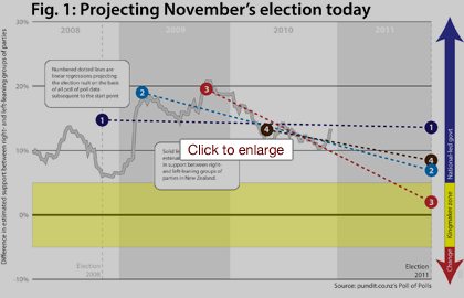
Look at Figure 1. It shows the trend of right-leaning support (National + ACT) as compared to left-leaning support (Labour + Greens) from Pundit’s Poll of Polls from March 2008 to December 2010, along with four projections of the 2011 election result. All are simple linear regressions, based on all the data subsequent to some starting point. All project the result of a November 26, 2011 election. And they project wildly differing results. Line 3 projects a squeaker, with the right winning by only two points, and the election result up to the Maori party (this was basically the version used at The Standard), while line 1 projects a right-leaning landslide. Indeed, if you took the 2008 result as a fixed gauge of support as opposed to an estimate, and then ran your regression on all subsequent data, you would project an even bigger thrashing.
The problem is that the analyst gets to choose the starting point, and there is not really a good reason to choose one starting point over another. The left-leaning authors at The Standard choose the peak of National’s support as their starting point, and unsurprisingly it shows a decline. Right-leaning authors might choose a trough in right-leaning support (say, the election) and show the exact opposite. That is where the rabbit goes in the hat.
2. Trends don’t last a year.
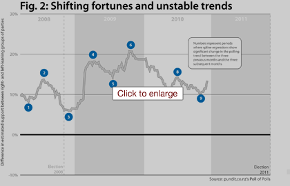
Every projection, no matter the start point, is based on the premise that the broad trend we are following now will more or less continue through until the election. Without that kind of assumption, you cannot project. But, as Figure 2 shows, trends in New Zealand politics do not last a year. In fact, they last only four months on average.
I ran a hundred or so of spline regressions on the weekly Poll of Poll data to determine when the three-month trend, which usually encompasses 8-10 polls, significantly changed direction*.
It changed direction nine times over 33 months. Nine times. The locations of these changes are not analyst-determined; instead the data tell us when the poll-to-poll shifts stop being usual sampling error variation and become a real change in the trend. The longest period without a shift in the trend was the right’s steady eight-month slide from late 2009 through until the 2010 Budget. These data suggest our polls are pretty volatile and hard to predict. Who would have guessed, for example, that the public’s reaction to a Budget 2010 tax package that they overwhelmingly liked would be to strip the government of support (point 8)? In the face of evidence like this, are we really willing to believe that any linear trend evident now will still be going in November? I’m not.
* * *
So if we can’t use polling aggregates and trends to project the election, what good are they? I think these data are helpful in one retrospective way and two prospective ways. Retrospectively, the trend helps parties and pundits alike figure out what worked and what didn’t for our various political parties. Did the reversal of tax cuts in Budget 2009 hurt the government in any sustained way? Not really, despite the immediate post-Budget polls. Did Phil Goff’s “The Many Not The Few” speech in early 2010 cause the polling gap to narrow? Hard to say, because the narrowing trend was already well in place before the speech.
Prospectively, knowing what worked in the past helps us predict whether similar tricks are likely to work in the future. In addition, the polling averages and trends can help us figure out the state of play today, and also how easy or hard it will be for parties to achieve their goals by election day.
For example, poll-of-polling at the end of last year showed the left about 13% down. In order to have any chance at the election, they need to pull back at least 10 of those 13 points by November (I’m running with the ipredict verdict that Winston will probably not make it back).
Is there recent precedent for this kind of shift? Yes there is – the government lost about 10 points of support in late 2009 / early 2010, and lost 7-8 points of support in the last few months of the 2008 campaign. Sustaining such gains consistently for 10 months, without going through a bad patch themselves, however, looks like a tall order given recent patterns of polling swings. That is the challenge facing Phil Goff and his recently reshuffled team.
*For the nerds: Each spline regression was based on 26 weeks of data, the 13 weeks prior to the week in question and the 13 subsequent weeks. There were two simple counter variables on the right hand side, one that counted up the whole period (1, 2, 3… 26) and one which counted up only the weeks after the week under examination and counted all previous weeks as zero (0, 0, 0… 1, 2, 3… 13). Significance on the second variable indicated a change in the polling trend. Three or more consecutive weeks of the same directional result on the spline regression are taken as a real change in the trend.

